
Product pages are the heart of your Shopify store. These give customers all the information they need to make a decision about whether or not to buy from your brand. You could have an amazing product, but if the page for it isn’t up to customers’ standards, it simply won’t sell!
Understanding the importance of product pages is one thing, but it’s another to understand what makes for a great page. At its core, a great product page has to be focused on customer or user experience. Everything from the colors to the amount of text to the images all take that experience into consideration. This all has a real impact on customers’ purchasing decisions - 87% say that product page content is important to their decisions, and 98% have been dissuaded due to insufficient content.
Today we’re going to look at what makes a great customer experience led product page, and some real examples from top Shopify brands.
What makes a great product page?
Let’s start with a checklist of all the qualities that are essential to a great product page. These qualities range from written content like product descriptions, all the way to how a product page is actually laid out.
Of course, how can a customer know if a product is suitable, if they don’t know what it looks like? Imagery is vital to any product page, and it can make or break a purchasing decision. 75% of customers rely on product photography when making a purchase, and 22% of returns occur because a product looks different in person than its photos online.
Great product pages should have a range of imagery, not just one! Some products will benefit from more images than others, for example a piece of furniture or an item of clothing. Different angles give the customer more visual information to work with. If it’s a product like a bag of coffee beans where multiple angles aren’t necessarily helpful, include context imagery instead such as the product being used.
The main call to action on a product page is the “add to cart” button. This should be clear both in word choice and appearance. The wording of the CTA should be recognizable to any customer - “Add to Cart”, “Buy Now”, “Add to Basket” and so on. It should avoid any overly branded language that may make it confusing. Appearance wise, it should stand out - if it blends in with the rest of the page then it won’t be obvious for the customer and this makes for a poor experience.
It should also appear “above the fold”, or in other words, at the top of the product page. This term originates from print media, where newspapers have a fold so you want the attention grabbing content to be above that fold. Imagine here in ecommerce the “fold” is the bottom of a screen, so you want your CTA to be visible without the customer scrolling down when the page loads.
Products in all niches have different options and selections before they’re added to a customer’s cart. It may be selecting a size for apparel, grind type for coffee, color and configuration for furniture and more. These should be made clear on the product page, and simple to select.
Any written content on a product page should be descriptive, readable and useful for the customer. You want them to know exactly what the product is, its benefits, uses, and details. That way it’s really clear what they can expect to arrive on their doorstep.
The key to great written content is to keep things easily understandable. Avoid lengthy sentences, and overly branded language. If your product requires specialist vocabulary such as in wellness or technology, explain these terms clearly. If you have a lot of detail to get through, consider having a summary description with bullet points then expand on individual points further down the page.
Every product has technical information, whether that’s a sizing guide for clothing or ingredients in a food product. Some products require a lot of technical information, such as a smartphone. A good product page will include all the relevant technical information a customer needs to know before making a purchase. It sounds obvious, but according to Baymard 83% of apparel store product pages they studied didn’t provide enough information on sizing.
This information can be included in different ways on a product page - it might be as a link to a different page with in-depth details. Or it could be as a diagram on the product page underneath imagery and the description.
How your page is laid out will directly impact the customer experience. There are key details that need to be kept closer to the top of the page, and other elements can be left further down.
In general, page layouts should consider customer expectations based on past experiences they may have had on other online stores. For example, on a desktop computer they’ll typically expect images to be on the left hand side of a page with pricing, CTAs, and the description on the right. On mobile, they might expect the name and price of the product to appear above the images.
Essentially, it has to make sense. It wouldn’t make sense to have the user reviews above the technical details for the product, or to have the price far down the page, for example.
It shouldn’t take for a customer to reach your checkout to find delivery information. According to Baymard Institute, 64% of customers look for delivery information on the product page. It helps to set their expectations, so there aren’t any nasty shocks when they decide they like a product only to discover higher delivery fees than they’re willing to pay.
You don’t have to go into your entire delivery terms and conditions to get this information across on a product page. Something as simple as “Free Delivery on orders over $50” displayed on the page, or a tab on the product page to expand for delivery information is ideal.
The power of reviews is something many ecommerce merchants are already very aware of - 93% of consumers say reviews influence their purchasing decisions. They are especially influential on your product pages, where conversion rates are as much as 3.5x higher on pages which include reviews than those who don’t.
Your product page content - images, descriptions, technical details - give the customer the information they need, and reviews can seal the deal. These give customers the proof they need that your products are just as good as you claim them to be, with nearly half of consumers saying they trust online reviews as much as a personal recommendation.
These eight points are essentials to have for any product page. However, there are also other features which could be considered “added value content” and can enrich your page experience:
Did you know that 55% of consumers use video to help them make purchasing decisions? And 60% would rather watch a video than read about a product! Video is a powerful selling tool, as it can provide valuable context for customers. It can demonstrate how a product is set-up, or it can show how the product can be used. For example if they’re purchasing a pizza oven, a video can show how easy it is to get started. Videos can also give customers an idea of scale, for instance if they’re purchasing a piece of furniture they can understand more clearly how big or small it is.
A product description should suit the product, yet be concise and to-the-point at the same time so as not to overwhelm the customer. That being said, there may be additional information that helps to convey the benefits of the product which would aid the customer. That’s where expanded descriptions may become valuable. It may be that you sell running shoes, and want to dive deeper into the specific benefits of the materials.
At times, customers will have more questions about a product than the description can provide. Don’t leave it up to the customer to find more information, give them what they need right on the product page. For example if you sell a gift subscription, then a customer may have questions about how it works - you can use an FAQ section to help them without leaving the product page.
Product recommendations are a key feature on many product pages. The reason they’re included as “Added Value” and not “Essential” is that knowing about another product isn’t strictly necessary for a customer to make a purchase on the product page they’re viewing at that moment in time. However, they are extremely valuable - if a customer is viewing one product and decides it isn’t quite right, a well placed recommendation could instead pique their interest.
They also aid in cross-selling and up-selling. If you have a product which has accessories and add-ons, these are highly valuable to include on that product page. To use an earlier example, if you sell pizza ovens then there may be cleaning products, carry-cases, cooking tools, etc. that you want to up-sell.
Considering the different elements of a product page and how they impact the customer experience is important. Doing so will enhance your store, and can lead to higher conversion rates, which can in turn improve discoverability in search results. Essentially, your product page experience is so good that it encourages customers to make a purchase, which signals to search engines it’s a page worth ranking. This then brings in more new customers, who in turn discover your amazing customer experience.
Now, let’s see some examples.
Note: In this article, we’re going to focus on the desktop experience - we’ll be publishing a mobile product page listicle in the near future!
#1 - Skims
Founded by Kim Kardashian, Skims is a global brand specializing in shapewear, underwear, loungewear and more that makes any and everybody feel good. They focus on solutions for every shape, with a range of products that tackle different issues like support and fit. So, their product pages focus on that “for every body” mindset.
Skims’ product pages are concise, but packed with highly valuable and useful information for their customers. Let’s take a look at their “Soft Lounge Slip Dress” as an example.

Right away, the product page above-the-fold is clear, concise, and gives customers the key details - price, product name, colors, sizes, and images. The thumbnails on the left hand side of the page indicate to the customer that there are more images if they wish to see other angles, and upon scrolling down they’re offered the option to view the product in a range of sizes.

This is a unique feature that’s true to the Skims brand, and gives their customers valuable context for the product. With inclusive sizing, one set of images of a product on one body type may not be enough for a customer to make a decision. Especially if they’re much smaller or much larger, or have a different body shape. By giving customers the option to view the same product in different sizes, they make it easier for customers to envision themselves wearing and liking the product.
Just a quick scroll will give the customer a recommendation for a complementary product, as well as the description, delivery details, and technical information.

The description is succinct, but conveys the key features of the product. On expanding the “Fit & Fabric” tab, the customer is offered more details on the fabric makeup of the product, as well as the features, care instructions, and other details.

Given the range of products in all different configurations, shapes, and styles, Skims offers customers a range of different recommendations based on their browsing habits, similar styles, and other products in a similar color.

These recommendations cover a wide range of customer needs. Whether the customer is looking for something of a similar shape or color, or if they just want to browse other pieces in the same collection. It could be seen as “too many” options, however the number of recommendations is in line with the brand purpose and USP and therefore, it will make sense to their customers.
TL;DR - Why this product page works
- Clear above-the-fold layout that makes it easy to find price, colors, and sizes
- Variety of images for each product including different sizes and colors
- Complementary product recommendation high up the product page
- Concise description with technical details and shipping information in easy location
- Wide range of product recommendations sensitive to customer needs
#2 - Niche Beauty Lab
Feeling good in our skin is important, and that sometimes requires great skincare. Niche Beauty Lab is a game-changing skincare brand that formulates and develops all its own products in their own labs. They take the science behind skin seriously, with a commitment to quality and using innovative active ingredients.
Any product involving scientific or technical terms can become confusing for customers. There can often be a lot of jargon involved, and so it’s up to the merchant to make those products easily understandable to a wider audience. Let’s see how Niche Beauty Lab do this with their “Acnemy” product page.

Right off the bat, Niche Beauty Lab gives customers clear information about the product. The product description summary explains the use and benefits of the product, along with the primary ingredients. While those ingredients have technical names - Salicylic Acid and Azeloglycine - it is explained in simple terms what those products do. The customer can clearly understand right away what the product is, what it does, and some of the basic ingredients.
Expanding the description gives the customer more information.

This is more effective than having all this information immediately on the product page. It’s a lot for a customer to take in all at once, and it would push the CTA further down the page. The summary description allows Niche to concisely explain the product, with this expanded description offering additional information.

On expanding the other tabs, customers can find more useful information about active ingredients, use and who the product is best suited for. With products in the beauty and wellness industry, customers want to know all of the details about a product in order to make the best decision. After all, it isn’t as simple as buying a t-shirt and seeing if it fits - something like skincare can have an impact on the health of their skin if used. This requires clear information, presented in an easily understood way.
After the main body of the product page, Niche includes a video that shows the product being held, dispensed, and applied. This gives customers a better understanding of the size of the product, what it looks like out of the container, and where the product should be applied.

And to round the page off, Niche includes product reviews and recommended products. Visitors can read the experiences of past customers, to better inform their decisions. If they feel the product isn’t quite what they need, Niche has those helpful suggestions ready for them.
TL;DR - Why this product page works
- Clear page layout gives customers a wide range of information above-the-fold.
- Product description has both a summary and expanded description so as not to overwhelm customers immediately while still giving enough information.
- Scientific terms are clearly explained through their benefits and use.
- Customers are given clear information about who the product is for, and its active ingredients.
- Reviews and recommended products give additional helpful support and context.
#3 - Neighbor
Tired of the same old designs for outdoor furniture? Then say hello to Neighbor. They create stylish, functional outdoor furniture that’s design-driven and perfect for the modern garden. Not only do their pieces look great, they’re also super comfortable and highly durable. Bringing that flair of interior design to a home’s exterior is a tricky enough task, then they also have to consider who will use the furniture and when, and how it can best survive outdoors.
Buying any kind of large item online can be a little nerve-wracking for any customers. After all, what if it’s too big? Too small? What if it’s just not suitable? It’s a bulky item to try and return, and that can make customers hesitant if they can’t see it in person. Neighbor’s product pages are designed to address all of the issues a customer might have when thinking about a purchase.
We’re going to take their “The Sun Lounger” as an example:

Neighbor’s product pages are clear, eye-catching, and packed with detail. The large image gallery gives all different angles of the product as well as a contextual image rather than just one large image with a smaller gallery. This gives customers a clear view of the product right away, combined with the product by-line underneath the name - “Teak outdoor chaise lounge chair”.
Right underneath the product name and by-line, they give the price, star rating, and some delivery information. Furniture can often have varying delivery times due to warehousing, so giving customers a timeframe right away helps prevent any surprises at checkout. The description below the CTA gives a concise summary of the benefits of the product that can’t be conveyed in the image gallery such as its adjustable back and quick-drying cushion material. Given the cost and use of the product, Neighbor also gives customers access to their warranty policy right on the product page for additional peace of mind.

Scrolling down, Neighbor then gives a detailed diagram of the dimensions of the product, along with its weight and how many boxes it will be delivered in.

Customers who are interested in the product can then better assess the suitability of the product for their needs. They can even check the measurements in the space they plan to put it in to double check before they even place an order. Below this, Neighbor includes some additional delivery and returns information.

Customers now know what the product looks like, its benefits, dimensions, and that they can test out the product for free. They don’t have to go and check other pages for this information, but the page itself isn’t cluttered and overwhelming.

Neighbor then goes into a little more detail about the durability of its product. It can be difficult to tell just based on a photo and a list of materials whether or not a product will be durable. Especially with something like outdoor furniture which will need to withstand the elements, this is a key concern for Neighbor’s customers. By providing a clear, easy-to-understand summary of the durability of the sun lounger, customers can feel more confident in their purchase decision.
On their product pages, Neighbor also includes a brief FAQ with some of the most common questions about each product.

Again, this keeps customers on the product page preventing them from navigating elsewhere and perhaps becoming distracted from making a purchase. Along with their reviews, Neighbor’s customers can include photos as part of their review so future customers can see what the product looks like in real-life. This helps demonstrate that it doesn’t just look good in curated studio imagery and renders, and the customer can better visualize the product in their own garden.
TL;DR - Why this product page works
- Image gallery gives customers a clear picture of the product from different angles.
- The above-the-fold of the product page gives all the initial details a customer wants - what the product is, what it looks like, how much it costs, and how long it takes to deliver.
- Detailed dimensions allow the customer to know exactly what to expect and decide on its suitability.
- Important information on delivery, returns, and warranty is included for added peace of mind.
- The FAQ section provides customers with extra details that keep them on the product page.
#4 - Peet’s Coffee
California coffee favorites Peet’s have been on the bean scene since the 1960’s serving up fresh brews and delicious at-home coffee. They selectively source their coffee from farmers around the world, then roast the beans to give their customers the ultimate bean to brew experience. They’ve got you covered, whether you’re grinding it up yourself for an espresso machine, or want some handy coffee pods or cold brew.
With a product like coffee, there’s huge variation in the level of product knowledge. Peet's customers range from people who want a quick cup of tasty instant coffee all the way to caffeine aficionados with a regional preference. So, their product pages have to account for that difference and provide every customer with the best experience.
Let’s use their “French Roast” coffee beans as our example:

The content is kept concise and to-the-point above-the-fold, giving customers a quick summary of the product’s tasting notes along with plenty of information and options for ordering. If a customer knows they want this style of coffee, they can quickly select the grind they want, how many bags, and if they want to subscribe for regular shipments.

Peet’s include the price saving if a customer does choose to subscribe, along with the fact they get free shipping. This makes the option more enticing to the customer, by demonstrating the benefits of a subscription. We also get a few images to show the bag and the beans - not much more is needed for this type of product unlike previous examples. And to finish off this initial view of the product page, they also include some shipping timeframes so the customer knows what to expect before they reach the checkout.
Scrolling down, customers are given more information about both the product, and what to expect when ordering from Peet’s.

Peet’s first outline some of the benefits of ordering. With coffee beans, fresh is best, so they’re sure to tell customers that they are committed to fresh coffee for every order. Below this, they go over the flavor profile for the coffee. This comes with easily understood tasting notes, and a clear sliding scale diagram to give customers a better idea of what the coffee tastes like. This is especially helpful for customers with lower product knowledge, whether they’re new to coffee beans or buying a gift. If they need additional help, Peet’s also offers a coffee quiz to aid the customer in finding the right product. This is hugely beneficial to the customer’s experience with the brand, and makes it more likely they’ll find a product they’ll enjoy and want to buy again.
Below this, the customer is given a short blurb on the origins of the coffee, with a link to learn more.

This speaks to those customers who are interested in coffee as a topic, who may have higher product knowledge. Peet’s then offer some brewing guides that are suited to their French Roast beans.
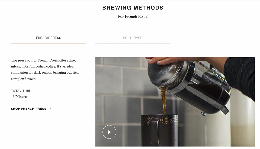
These come complete with videos and recommended brewing equipment. This is unique, in that it both enriches the customer experience and also acts as a cross-sell or product recommendation. They’re using another product they sell to demonstrate how to best enjoy their French Roast beans. The customer may then be tempted to also purchase the equipment needed to get the most out of their new beans. The video itself is engaging, and adds more to the product page for the customer to explore.
TL;DR - Why this product page works
- The above-the-fold information is kept concise, with clear delivery information and easy-to-use variant selection.
- The page encourages subscription purchases over one-off purchases by showing the savings and benefits on the page itself.
- Added details help to convey the key selling points of ordering online, i.e. freshness and delivery.
- Tasting notes and a quiz flow give the customers more in-depth but simple to understand information to enable them to make the best purchase decision.
- Video content provides customers with a more engaging experience and encourages them to explore other complementary products.
—
Product pages are central to any ecommerce store. They can provide customers with not just their first impression, but also all the information they may need to make a purchasing decision. If you get it right, you can increase conversions and improve the customer experience all at once.