
Mobile ecommerce is big business - in 2020, mobile accounted 70.4% of global retail ecommerce sales up from 52.4% in 2016. Search on mobile is also growing exponentially with 54.8% of searches being performed on a mobile device, up from 31% in 2015. It’s importance to the customer experience really can’t be overstated, as 59% of consumers say that being able to buy on mobile is a deciding factor in which retailer to make a purchase from, and 79% saying they’d revisit and recommend a brand if it has a good mobile experience. With this in mind, it’s clear that mobile is a priority for consumers and therefore a priority for search engines.
Mobile and its importance to SEO strategy
In order to understand how mobile impacts SEO, we’re going to focus specifically on Google and its relationship with mobile. In 2018, Google implemented something called “mobile-first indexing”. Essentially instead of indexing desktop sites first, Google decided to prioritize mobile sites - regardless of if you’re browsing on a mobile or desktop device. This means that if your site isn’t optimized for mobile then it’ll impact your SEO.
Then we come to Core Web Vitals and page experience signals implemented in 2021. These are a set of search signals that together amount to a ranking factor based on what is important to user experience.
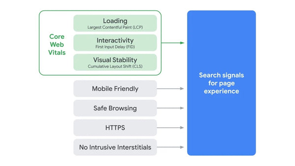
Core Web Vitals are three that are essentially related to page load speed. The other signals relate to other factors that Google has deemed important to how a user experiences a page such as knowing that page is secure so you don’t run the risk of someone gaining access to your credit card information if you make a purchase. You’ll notice that “Mobile Friendly” is also one of those signals. People on average spend 70% of their internet browsing time on a mobile device, so if a page isn’t optimized for mobile this sends signals to Google that it has a poor user experience and this then impacts ranking.
6 ways to improve your store’s mobile SEO
Before we get started, it’s worth noting that Google has a resource called Test My Site which will give you some insights on how your store performs on mobile. Use this as a starting point to get some recommendations and an idea of where your store could be improved for mobile.
#1 - Ensure you have a responsive design
If you’ve ever gone on a website on your smartphone only to discover that its design hasn’t been optimized for mobile, you’ll understand how frustrating it is as a user. It’s clunky, difficult to read, tricky to use, and more often than not you’ll just give up on it. That frustration leads to higher bounce rates and along with Google being able to determine if it’s mobile responsive, it can impact your store’s ranking. A responsive design should adapt to the resolution and dimensions of a user’s device be that iPhone to Pixel, or smartphone to tablet.
If you’re a Shopify merchant, then we’ve got some great news - all of Shopify’s themes available through their catalog come mobile responsive as standard. This takes a lot of the work out of optimizing your store experience for mobile including design as well as functional elements such as checkout, and allows you to focus on other factors like page content and speed.
#2 - Get your site speed lightning fast
We’ve written before about the importance of site speed to your store’s SEO, and it’s especially important for mobile SEO given that 63% of US Google searches are conducted on mobile. That mobile experience being as fast as possible is a deciding factor for many consumers, and can seriously impact your store’s conversion and bounce rates. According to Google, 54% of consumers say that their frustration grows the longer a mobile site takes to load, and making an improvement of just 0.1 seconds to a page’s load time can improve conversion rates by as much as 8.4%.
So how do you improve your site’s mobile load times? The best place to start is by using Google’s PageSpeed Insights tool to get an idea of what your current load times look like. Once you have an idea of what’s holding your store back, you can start to make improvements such as:
- Leverage browser caching to reduce the amount of time it takes for content to load.
- Make use of a Content Delivery Network (CDN) - this is something that comes as standard for Shopify merchants.
- Compress content such as images to reduce file sizes and boost load time.
#3 - Avoid unnecessary interstitials/pop-ups
No customer likes an intrusive pop-up, and neither does Google. They can block the user’s view of content they want to see, can be difficult to close on small mobile screens, and they can also slow a page down. Therefore the less you have, the better for your mobile experience and the more favorably Google will see that experience.
There are, however, some exceptions and guidelines for what constitutes an intrusive interstitial and what is acceptable. Acceptable interstitials include age verification, and cookies related pop-ups.

If it’s promotional, then that’s fine so long as it doesn’t dominate the page or affect usability. Unacceptable interstitials are any which aren’t necessary such as the aforementioned age verification pop-up, and make it difficult for a user to actually see the content or use the page in question.

#4 - Optimize your navigation, forms, and readability for mobile experiences
Usability is important for your user experience - if your site isn’t easy to navigate or it’s difficult to read, people will simply leave. There are three key usability factors that you should consider as part of your mobile optimization for SEO:
Navigation - This is a great tip for your navigation in general, but keep it simple. Especially for mobile, users don’t want to have to click through lots of different menu options to reach the content they want. Make all calls-to-action clear and easy to click on.
Forms - If you have forms on a mobile page, make sure they’re easy to use, simple to fill in, and adaptive where possible. For example if you require a name and the next field is a phone number, make it so the appropriate keyboard shows up for each to make it easier. Keep details required to a minimum so there isn’t as much to fill in.
Readability - Text should be large and legible, and there should be clear contrast between the background and text. If it requires the user to zoom in, or the colors on the page make it hard to read, then you should consider changing it.
The goal is to make the mobile experience as easy as possible for users. These are all factors that we take for granted until we land on a site that hasn’t been properly optimized without taking mobile into consideration, and suddenly it becomes clear how important things like font size and simple navigation are to our perception of a brand’s experience.
#5 - Show users the same content they’d get on desktop
Your store’s desktop to mobile experience should be as seamless as possible, and this also applies to your content. It’s fairly easy to come to the conclusion that if you want to make the mobile experience easy and fast, then you should reduce the amount of content that the user has access to on a given page compared to your desktop site. However this is the opposite of what you want to do, and this is down to Google’s mobile-first indexing. Google prioritizes mobile sites over desktop, meaning that if you have a lot of content on your desktop site that targets keywords and other SEO content tactics and it doesn’t translate to mobile, you’ll risk losing rankings on SERPs.
Instead, prioritize keeping your content the same on mobile as on desktop, using responsive design and on-page navigation to make the experience both content rich and readable for users. That way, they won’t miss anything and you’ll continue to rank as the result of all the hard work you’ve put into SEO-led content. Beyond just SEO benefits, we’ve already covered earlier in this article that more consumers are spending time on mobile; if all your best content is on your desktop site, there’s a large portion of your potential customer base that won’t see it if they only see your mobile site.
#6 - Prepare your store for local search
Taking out your smartphone to look up where to eat locally, or where to buy something you need is almost second nature nowadays. Mobile search makes up 84% of all “near me” queries on Google, meaning local SEO is becoming increasingly important if your business has a local element. Here are a few things you should do to optimize your store for local SEO:
- Keep your Google My Business listing up-to-date
- Use keywords specific to your local area
- Include your city and state in your site’s metadata
- Encourage reviews on Google, and respond to as many as possible
If you want to learn more about local SEO in general, you can check out our previous article here. And if you want to leverage local SEO but don’t have a physical location, you can read more about that here.
----
Mobile ecommerce is a huge opportunity for merchants, and many of the improvements you can make to boost mobile SEO will also hugely benefit your mobile experience for customers in general. By making sure your site loads fast, is responsive to the device its displayed on, and is easy to navigate, you can deliver an experience that delights potential customers and boosts your ranking with search engines.